Wednesday, 31 October 2012

My Artist Statement


I am Cathrine Mboneka. Born on the 24th of July 1992 in Zimbabwe and raised in Luton, England. I started out as a child rather into art. Around the age of 6 is when I can mostly remember as being the start of my interest in art. I was amused by illustrations in a Ladybird book that I used to own. It wasn't until I was around the age of 12 that I really got into drawing. It started off with my wild imagination pondering into becoming a cartoonist later on in life after being exposed and bombarded by cartoon channels and children's programmes on a day to day basis. I used to make up my own characters and give them personalities and try to sketch them down. This carried on until I was 14. 

In high school I was not yet sure what subject in art I wanted to get into. There was only 1 art class and the first thing that came to my mind is that it would only be Fine Art. Rewind back to when I was the age of 12 I had started to experiment on Microsoft paint with my fictional characters, this gave me an idea for some reason that computing and IT would be the subject I would have to do so to do the things i was starting to get in. I was trailed off to do the wrong subject and little did I know about or even heard of Graphic Design.

In high school I learnt about Fine Art and discovered artists like Picasso, Gauguin and other painters. This really got me into painting but that was all. It wasn't until I applied for a foundation in Art and Design that I learnt about so many other aspects of Art. I experimented in photography, print making, mixing media and typography etc. thus guiding me graphic design.

Below is an example of my wine glasses and bottles painting I made using acrylic paint on wood. I did a cubism style work piece here.


Below is another piece I did in 2009 in my foundation class using tracing paper, water colour, tea staining, pencils colours and oil pastels which was a research page I did on culture in Korea. This is usually what I love doing in most of my work, mixing media to create different textures and tones. This was the peak of my illustrating skills. My first look into illustration. 


Later on in 2010 and 2011 I mostly worked on my graphic design side. I studied graphic design at Barnfield College for two years and during that I expanded more into printmaking and monoprinting. Below are 2 example of printmaking I did and then I enhanced and added colour on Photoshop. These were meant to be posters on a poetry assignment and the line from the poem was "my incomplete unsatisfied words"


My style of working is rather messy. I don’t really get too much into detailing but I think shapes can characterize more than detailing.  During this time at Barnfield studying graphic design, I was exposed to various techniques of making pictures. Screen printing, linocuts, etching etc. something that would like to explore in the future myself.  This also takes me back to when I was around 15/16 years old when I used to experiment on Photoshop with brushes and such. I would say at first I really enjoyed going on the computer more than constructing things myself however I would like my future work to be somewhat more practical


Another aspect I really got into was page layouts and book design design which brought me back a memory to when I was looking at my ladybird book. We were then given a project on book cover design and below is a picture of what I did.


As you can see by the title "The Diary Of Anne Frank" it was a project based on Anne Frank. Tried to capture the innocence of childhood by showing the children as white (which represents pure) and then the actions of the children running away from something to represent fear and the black background for mystery.

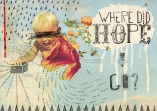
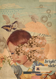
The work I frequently do is inspired by, not a specific artist, nevertheless a certain style or element of an Artist. For example I like using earthy colours a lot for watercolour based imagery just like Arthur Rackham and on the other side when it comes to Pop Art, I like primary colours that stand out just like most of Roy Lichtenstein’s work. My layout of type is similar to Jan Tschichold’s and I truly admire the way he places text around a page. I like to cut an paste pictures/bits and bobs I like and create a collage too like Eduardo Recife. These Type of Eduardo Recife styles can be found in my Polyvore illustrations i did here on my official polyvore

Eduardo Recife

Eduardo Recife was born in 1980 in Brazil and is an artist, illustrator, graphic designer and typographer. He mainly uses collages, photography, paint and pencils. According to Recife he started drawing at an early age. He has been in the business and design industry since the mid 1990's. He produces his artwork for art journals, magazines and himself.

I would say most of my work is very much like Recife's work. I enjoy the used of collage a lot. I personally enjoy doing that digitally because i can move collages easier. Eduardo also enjoys doing his work digitally because he has more freedom to manipulate them as far as sizes, rotation, colour and sometimes cutting them.

'unknown'
unknown media/unknown date


'unknown'
unknown media/unknown date


'unknown'
unknown media/unknown date


'unknown'
unknown media/unknown date


'unknown'
unknown media/unknown date


Jan Tschichold

Jan Tschichold was born on the 2nd of April 1902 in Germany and was the son of a signwriter. His first career was in advertising as a calligrapher. He is best known for his for being a Modern Typographer that revolutionised graphic design with his san serif type who was hugely influenced by the bauhaus art movement.  In 1923 when he was 21 years old he was said to be a changed man after visiting the Bauhaus exhibition in Weimar. Tschichold recorded several fonts that were commonly used in his New Typography book in 1928. Jan worked as art director for Penguin Books from 1946 until 1949, which he is also best known for. His other interests are calligraphy, writing (since he was prodigious writer and researcher) and wood block colour printing.

To me, Tschichold is a very inspirational typographer. The way he breaks the rules to placement of type is incredible. Even on scale, angles and colour too, he uses his composition very adventurously and it all comes down looking so professional and neat. In my future work I will most definitely use his style of page design since I myself am hugely interested in page design.


'unknown'
unknown media/unknown date

'unknown'
unknown media/unknown date


'unknown'
unknown media/unknown date


'unknown'
unknown media/unknown date


'unknown'
unknown media/unknown date


Kavel Rafferty

Kavel Rafferty is an English Illustrator who is based in Barcelona, Spain. Her work is very versatile, she mostly produces modern illustrations where she combines techniques of print making, drawing and found imagery, painting and even collage to create her illustrations. Kavel loves the process of printmaking whether its screen printing, linocut or most recently risograph.

I love the colour use in these illustrations of hers. They are very bright and retro looking. The colours also bring the picture to life in many ways! The use of different techniques in Kavel's work inspires me in many ways and can make me relate to this style of illustrating because I myself prefer working with different media for my illustrations.

Although most of Kavels work isn't based on detailing but more on printmaking and layering, you can definitely identify objects that she is trying to show easier by their shape. i find that as something i could learn from her. The clever use of colours and typography is also something that i love about Kavels work. To me most of her work leans towards the pop art side of illustration.


'unknown'
unknown media/unknown date

'unknown'
unknown media/unknown date


'unknown'
unknown media/unknown date


'unknown'
unknown media/unknown date


'unknown'
unknown media/unknown date


Roy Lichtenstein

Born October 27, 1923 in New York City to an upper-middle-class family, Roy Lichtenstein is one of the most known Pop Artists in the Pop Art movement, as we know. Lichtenstein began his first Pop Art paintings in 1961. He grew up with no specific artistic influence. Most of his work can be identified easily by the use of Ben Day Dots in his work. He wanted his work to look like it was machine made although a lot of his work was made with stencils. On the other hand Lichtenstein is known for popularising the comic book style.

When I see Roy's work, I get fascinated by the different patterns he uses and how scale and colour can make something appear very appealing. In my future work I would love to use different patterns and he is my main inspiration. The use of primary colours in his work is interesting and shows you don’t have to have a massive hue of colour to identify scenery. Another thing that Lichtenstein does is vary the thickness and boldness of lines.


'Go for Baroque'
unknown media/unknown date

'Bedroom at Arles' 1992
unknown media

'Still Life with Goldfish Bowl and Painting of a Golf Ball' 1972
unknown media
'Two Nudes'
unknown media/unknown date

“Stepping Out”1978
unknown media

Arthur Rackham

Born September 19th 1867 in London, Arthur Rackham's first known appearance in print was in October 1884 in the magazine Scraps. Growing up Rackham was brought up in a middle class family. He is well known for illustrating children's book throughout the 'Golden Age' of British book illustration.

Rackham's technique was to sketch the outline of his drawings with a soft pencil, block shapes surrounding and add details, then after he had done that he would add his lines in pen and ink then removed the pencil marks at the end of the process. The peak of Rackhams word happened during 1905 and 1929. His work received both criticism and popularity due to the contemporary market for illustration.

I am mostly inspired by his work because of the amount of detailing that is involved in most of his work is wonderful. His work reminds me immensely of childhood imagination and fictional characters. The use of natural colours also strikes as appealing in my eyes and shows a sense of reality. Although his work was mainly based on Fictional characters, it gave me a sense of reality due to the use of colours and detailing involved. I find him a great role model when it comes to my illustrating. For him and I share the same techniques.


'Children by the sea'

unknown media/unknown date


'Peter Pan in Kensington Gardens

unknown media/unknown date

'Midsummer Nights Dream'

unknown media/unknown date


'Catskin' 1918

unknown media/unknown date


'Pandora'

unknown media/unknown date